Case Study: HairCrazy
Hair dyeing community and e-commerce website
HairCrazy.com is a busy community website and former e-commerce site focussing on bold, bright hair colours.
Comprised of a large gallery, forum, and tutorials, the site encourages users to upload hair photos, share tips and engage with each other through comments and forums.
-
Status:
Complete
-
Task:
A mobile-first total redesign, focussing on increasing the shop's conversion rate and visibility.
-
Challenges:
Creating a smooth transition to a simplified navigation for the existing user-base, integrating shop elements, maintaining the site's look and feel in a mobile format.
-
Goal:
Deliver a familiar yet improved design that works equally well on mobile and desktop, drive visitors to the site's shop.

Jump To:
Planning Research & Design Take AwaysPlanning
HairCrazy was established in 2001, and having been through a handful of redesigns, was now in need of a mobile-friendly update.
The existing navigation menu was complex and it was identified as a key
issue to resolve. The website's structure was re-mapped, with some areas of
the site unified to create a clean hierarchy to aid navigation for the
users.
This simplified structure was then used to develop a design system to create
a familiar and consistent mobile-first layout across the website.
Further opportunities to increase visitors to the website's shop front (e.g. cross-selling and in-content links) were highlighted and incorporated into the designs. My research highlighted opportunities for improving traffic to the site's e-commerce platform through integration with the rest of the site.
The key priorities were:
- Create an improved mobile experience
- Drive traffic to the shop and improve purchasing experience
- Simplify the navigation
Research & Design
Responsive Layout & Navigation Improvements
Google Analytics data had shown that over 80% of HairCrazy.com's visitors were accessing the site using mobile devices when the redesign was started in 2017. Creating a responsive website while maintaining the existing look and feel of the site was a top priority.
Key to improving mobile functionality was streamlining the navigation. HairCrazy's content had grown organically since its inception in 2001 which had caused the navigation to become bloated with multiple categories and sub-categories. Using card sorting, I reduced the number of top categories down from over 10 to just 4: Articles, Photos, Forum and Shop. Multiple sub-categories were combined to reduce clutter and the search function was promoted in the navigation and category pages to aid users in finding content.
Reducing the number of top-level categories allowed me to develop a
simplified top and bottom bar navigation for mobile and tablet users in a
responsive layout.
Existing page elements were appropriately scaled and re-ordered to
prioritise primary content in mobile layouts.

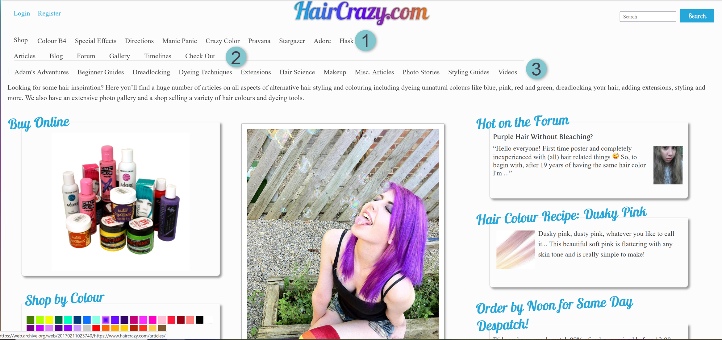


- Separate navigation for shop brands
- Top-level categories
- Expanded category on-click, shows sub-categories
- Navigation clutter solved with new menu; fewer top-level categories displayed as a persistent header on desktop and bottom bar on mobile
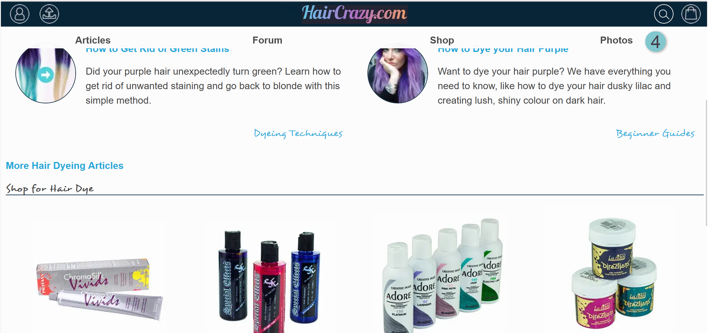
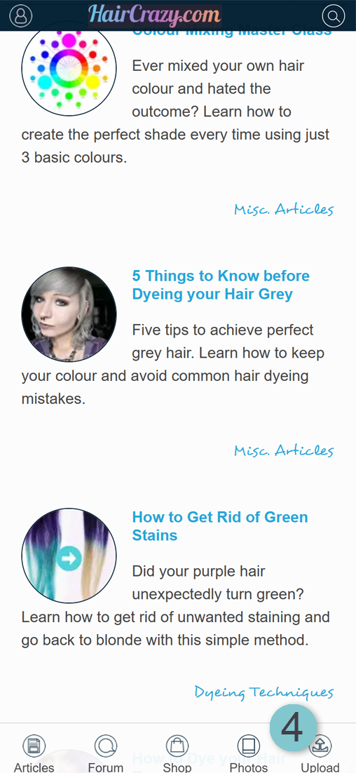
Improved Shopping Experience
I analysed customer contact emails to discover pain-points in the buying experience and interviewed users to gain insight into their experience of the site. In addition to the frustrations users were facing on mobile devices (such as having difficulty pressing buttons which were too small and problems with the menu pop-over), I was surprised to learn that some users were unaware of the shop's existence. I amended my designs to ensure that the shop was featured heavily on landing pages and introduced in-content links to relevant products, in forum posts and articles, to increase awareness and drive users to the shop.

Product Links
Product links from within an article, includes text link and configurable product widget.
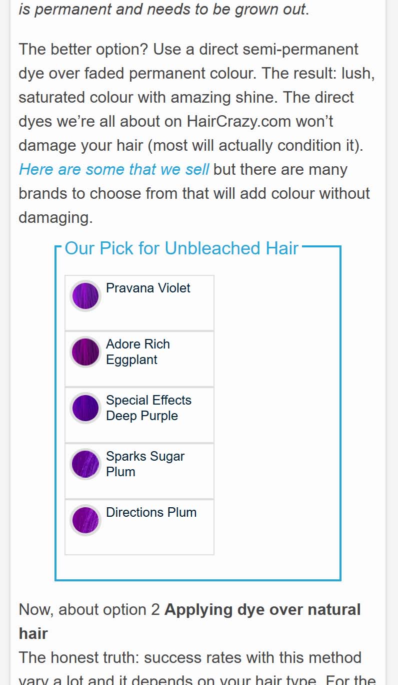
Product links from within an article, includes text link and configurable product widget
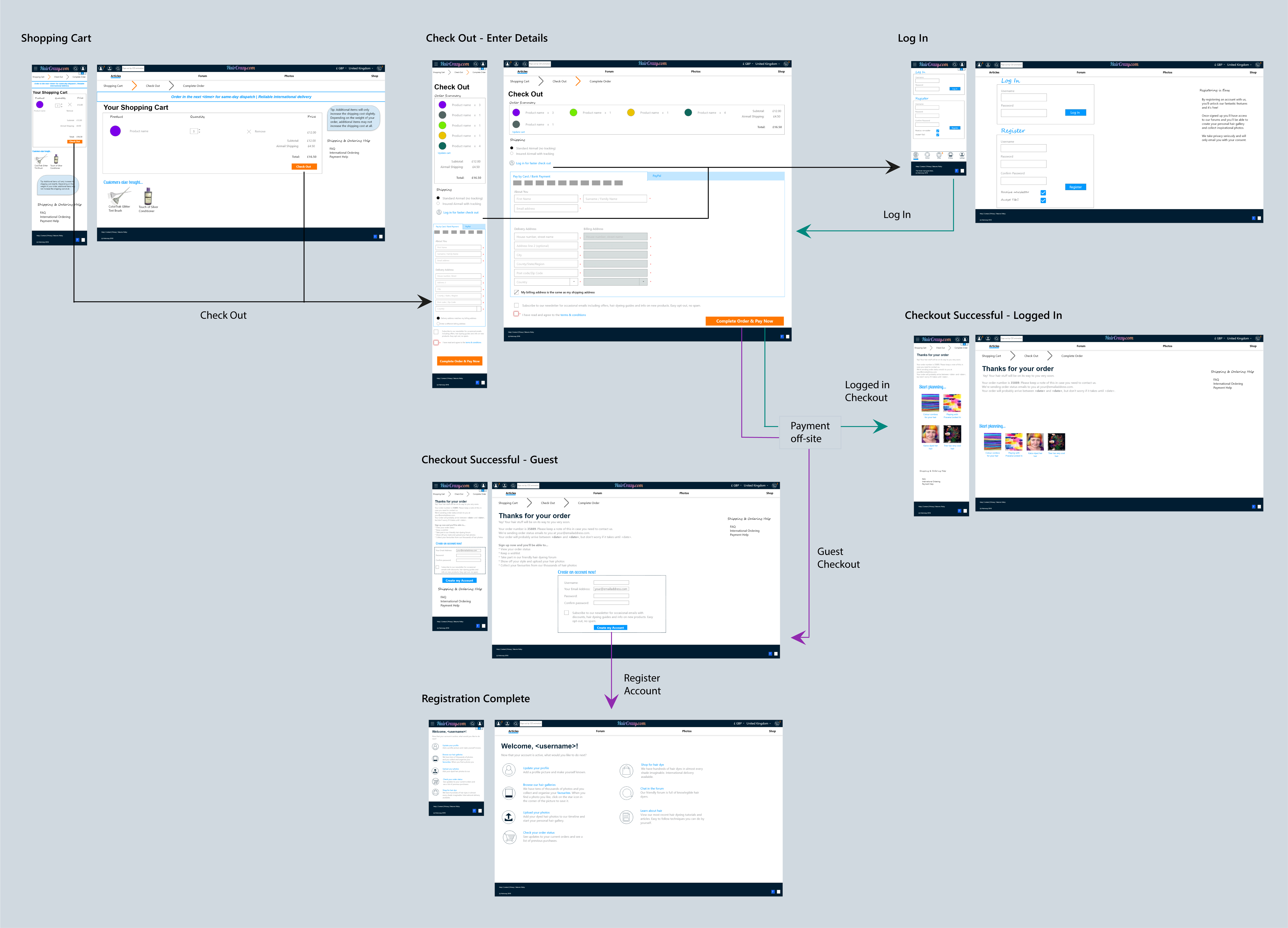
The customer emails revealed problems with the checkout process; for example, some customers found the postage options confusing and it was apparent that the wording had set expectations on delivery times which in turn generated more customer emails asking about specific order's delivery.
This problem was partially addressed by simplifying the checkout process and rewording the postage information. I also redesigned the order history page to illustrate the estimated delivery times visually and to provide detailed information on the order with links to relevant FAQ pages. Additionally, order fulfilment update emails were enhanced to provide clearer information.
Through these changes I was able to reduce customer contact emails by over 30%.
Google Analytics data was again valuable when assessing the checkout prior to redesigning. It showed that there was a large drop out in the purchasing funnel where login/register was required. This presented an opportunity to improve checkout completions; customers wanted faster checkout. I redesigned the checkout to include a guest checkout option and introduced credit card tokenisation to speed up purchasing for returning users.

HairCrazy's users rate photos as one of the most important features of the
website, so the new design was image-heavy.
An example of this can be seen in the redesigned product pages. Much of
HairCrazy.com's content is user-generated and it has an extensive photo
gallery of uploaded images. I incorporated user-submitted photos of
HairCrazy's members modelling the products and included honest reviews as
social proof to the buyer. To further reduce enquiry emails the new product
page included key information in bullet point form along with more detailed
information, such as an ingredients listing, below the fold.
Take aways
HairCrazy's redesign was a large and complex project which took over a year to complete.
One of the biggest challenges in the project was distilling the existing content into its essential parts. Doing so allowed me to simplify the structure and work on creating a system for page layouts and interactions and to deliver a consistent design. Working with a web developer, I was able to create templates and reusable widgets which to introduce a cohesive design. Adding structure also sped up the development process.
I learned that small irritations for users can be the difference between making a sale and abandoning the cart. Therefore, it's important to test changes and return to the users and stakeholders for feedback and to check measurable results in analytics to ensure no new issues are introduced.
The redesign was very popular with HairCrazy's users. Feedback included "Our new layouts look glorious!! Thank you so much for all your hard work!!" and "A great new look for the site! Very successful IMO."
It was satisfying to take on such a large project and to make noticeable improvements for the users and I really enjoyed designing such a colourful website with its large library of assets to draw from.
HairCrazy.com no longer sells hair products but the project goals of increasing visibility and traffic to the shop, and improving the customer's shopping experience were successful.